A key principle in my approach was deeply understanding our product, users, and how Smood fits into their daily lives. This guided every design choice I made.
Before the redesign, Smood’s digital experience felt outdated and cluttered, with inconsistent design elements. Navigation was complicated, making it hard for users to easily place orders or track deliveries.
My approach included UX research, competitive analysis, wireframing, prototyping, user testing, and UI design. One key challenge was ensuring a seamless experience across different user groups: customers and drivers.
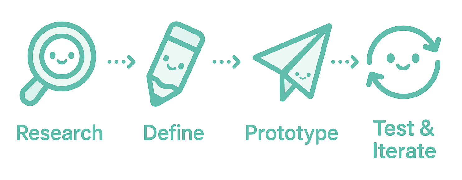
User-Centred Design Thinking: How I Solve Problems
- Empathise: Observe real users in context—how they work, where they get stuck, and what they need.
- Define: Turn key insights into a clear, focused problem to solve.
- Ideate: Explore a wide range of ideas, then narrow down to the most promising.
- Prototype: Build quick, interactive mockups—using Figma or even paper—depending on what fits best.
- Test & Iterate: Test with real people and refine until everything feels intuitive and seamless.
Competitor Analysis
I conducted thorough competitor research, analyzing popular food delivery platforms like Uber Eats, Deliveroo, and Foodpanda. This analysis provided insights into industry standards and opportunities, informing our UX strategy.
Design System
I developed a cohesive design system including typography, color palette, UI components, and interaction patterns. This helped create consistency across Smood’s digital products and accelerated our development process.
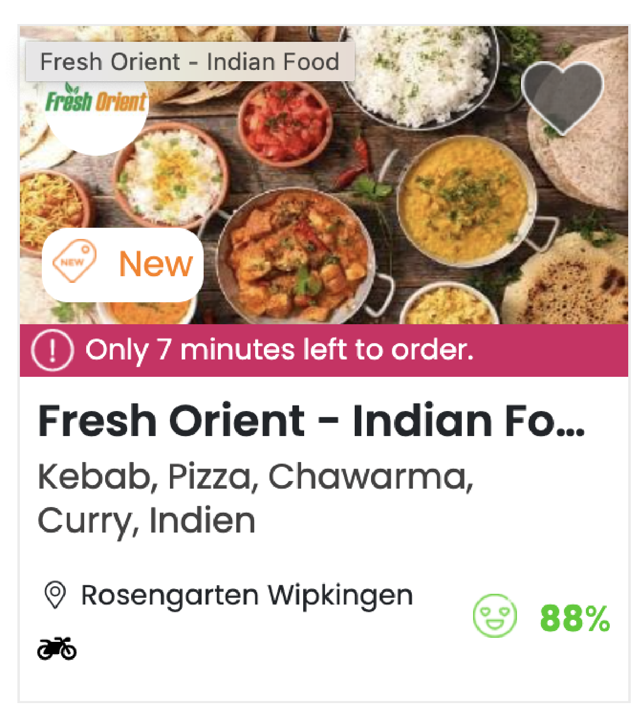
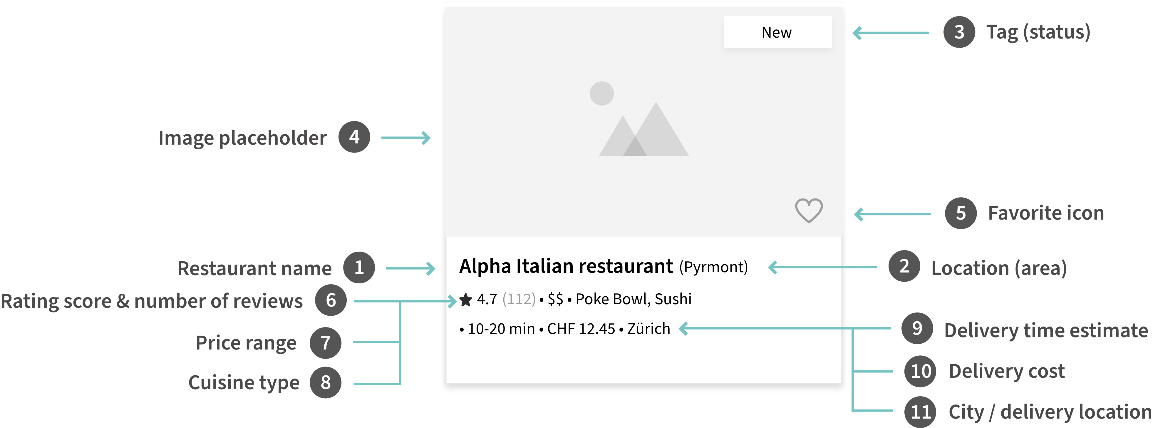
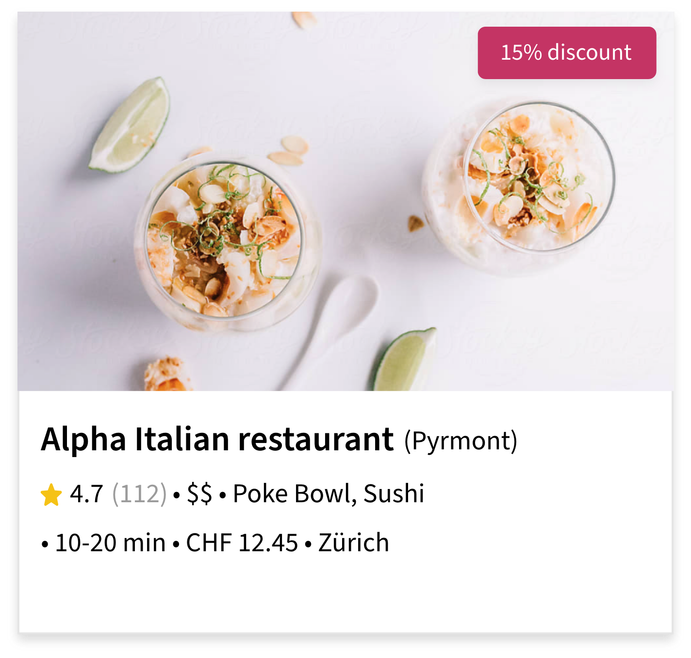
Redesigning the Restaurant Card
I redesigned Smood’s restaurant cards to display essential details clearly, making it easier for customers to quickly choose restaurants. The improved layout highlights ratings, delivery time, and cuisine type at a glance.
• Old Design
A cluttered card layout with inconsistent visual hierarchy and limited structure. It overwhelmed users with various tags, urgency indicators, and icons.
• Low Fidelity Wireframe
A structured layout exploration ✍️ Focused on organizing content clearly—breaking down restaurant details into smaller, readable parts for a more intuitive UX.
• Final Design
A clean, modern look with better hierarchy and balance 💖 It highlights key info at a glance, with an inviting image, clear ratings, and simplified layout for faster decisions.
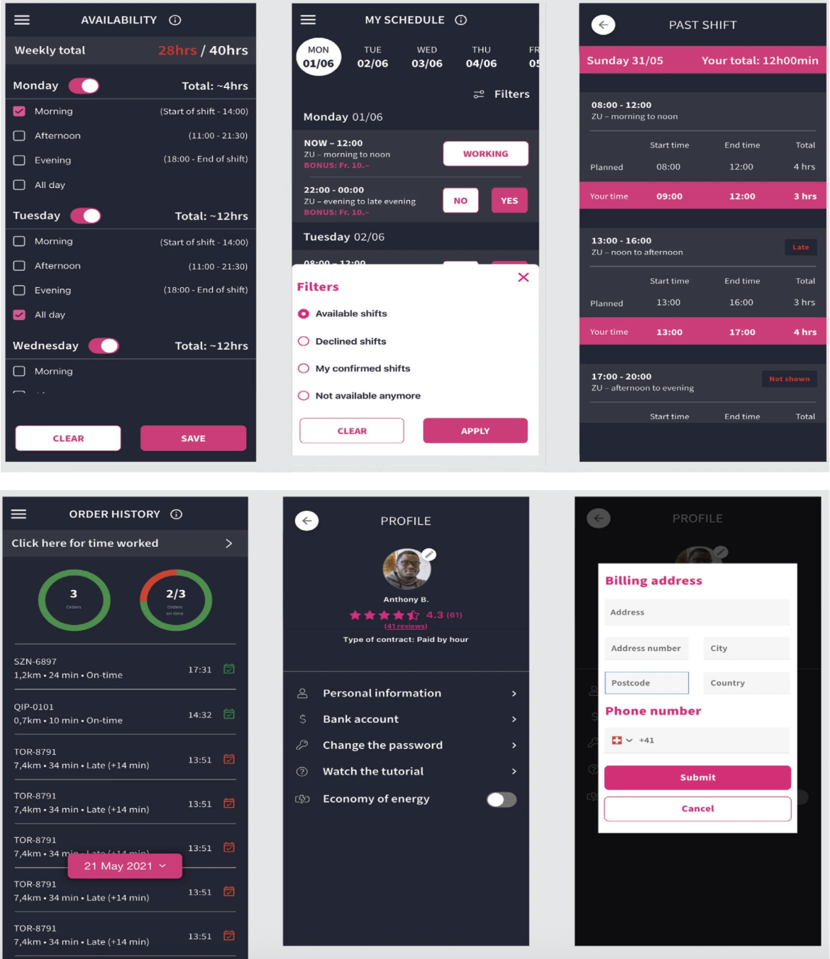
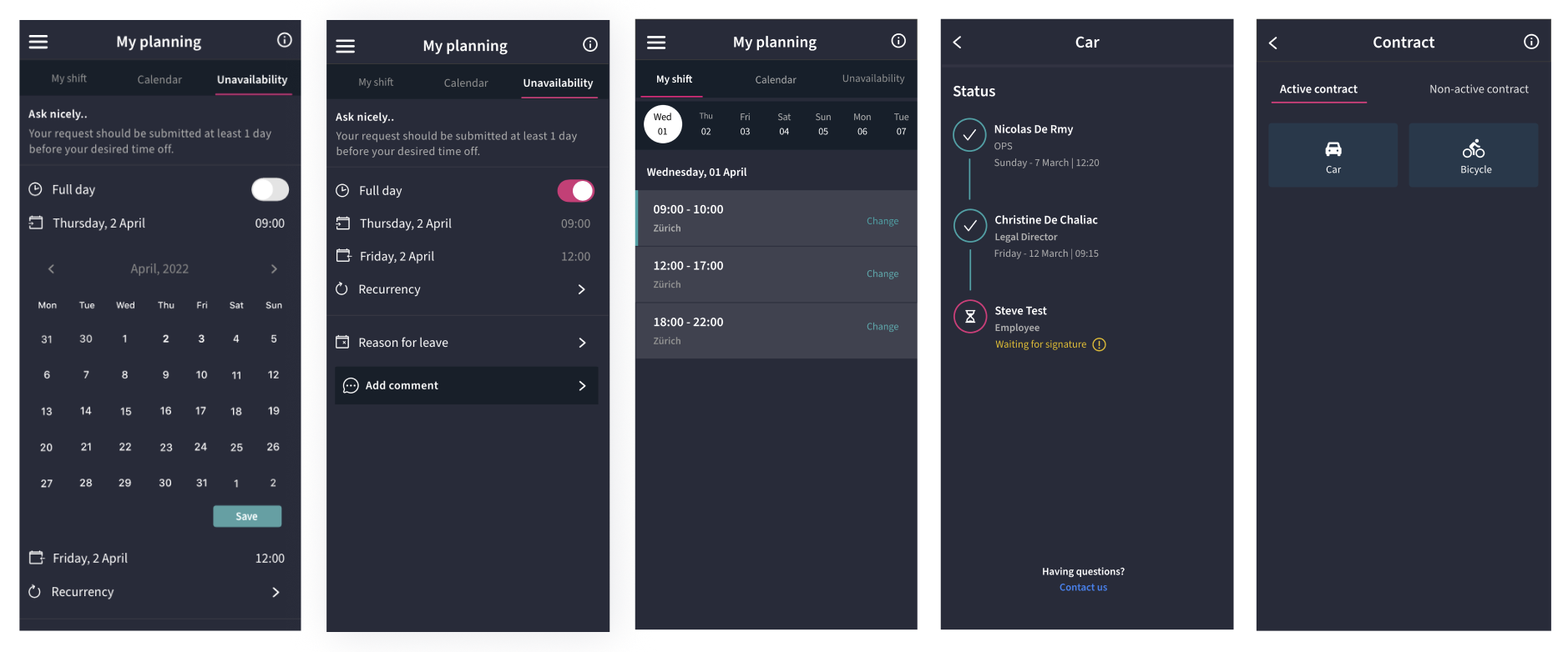
Driver Application Redesign 🚗
After interviewing drivers, I discovered many struggled with our driver app because it was complicated and not user-friendly, especially for those who weren’t tech-savvy. As a result, drivers often chose to work with competitors like Uber Eats, leading to fewer available drivers and negative customer reviews. To address this, I redesigned the driver app to be clear, simple, and intuitive. Drivers can now easily set their availability, select shifts, and communicate their time off using a straightforward calendar interface.
• Old Design
The previous app was cluttered and confusing for drivers, with too much information crowded into each screen. Drivers struggled to manage shifts, availability, and other key tasks.
• New Design ✨
I simplified the design, creating clear, intuitive screens. Drivers can now easily set shifts, view availability, and handle tasks effortlessly—improving their experience significantly.
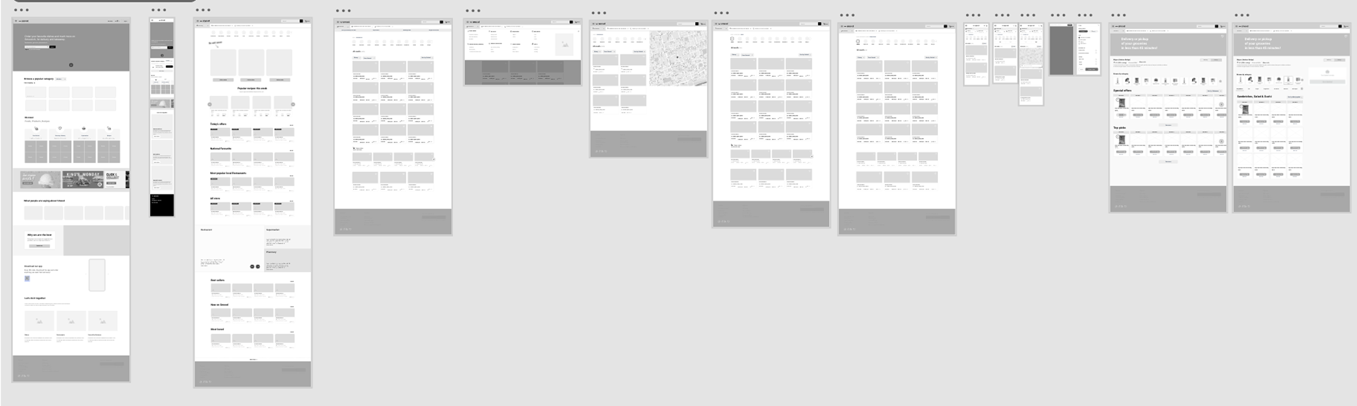
Wireframing Customer App and Website
I created detailed wireframes for Smood’s customer app and website redesign, prioritizing a clean and intuitive user experience. These wireframes simplified navigation, improved content hierarchy, and made key actions like ordering and tracking deliveries more accessible.
🌐
Check out the live website:
www.smood.ch